styled-react-modal 라이브러리로 customDialog 구현하기
Elice SW Track 7기 - 15주차 진행 내용입니다.

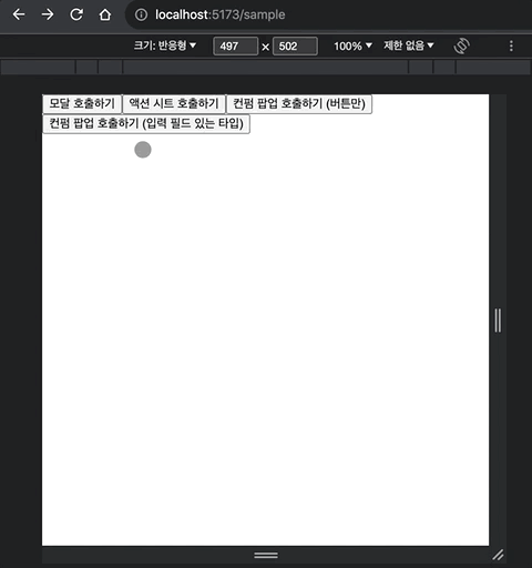
React 애플리케이션 개발 시, 반복적으로 사용되는 UI 패턴이나 로직들이 존재합니다. 가령 정보를 입력 받는 텍스트 필드나 스텝퍼, 라디오 버튼, 사용자의 선택이 필요할 때 제공하는 액션 시트나 컨펌 팝업, 부가 정보를 제공하는 모달이나 툴팁, 토스트 메시지 들이 그러한 UI 요소들 이라고 볼 수 있습니다. 모바일 앱이나 모던 웹이 발전하면서 그러한 UI들도 형태나 종류가 다양해졌기 때문에 애플리케이션 개발 시 어떠한 UI 패턴들이 있는 지, 또 어떻게 분류되는지 이해하는 것도 중요합니다.
참고 - UI pattern : 링크
하나의 애플리케이션에 필요한 기능들을 여러 명이 협업하여 개발한다고 가정해보았을 때, 이러한 UI들을 각자 구현하고 개발하게 된다면 시간적/비용적 비효율이 발생할 수 있기 때문에 이러한 공통 컴포넌트들을 별도로 개발하고 관리하게되면 운영이나 개발 진행 시에 보다 생산성을 높여 줄 수 있게 됩니다. 이번 글에서는 styled-react-modal 라이브러리를 활용해서 공통 UI 중에서 모달과 액션 시트, 컨펌 팝업 등을 작성해보도록 하겠습니다.
참고 - styled-react-modal 라이브러리 : 링크
목차
4. 액션 시트 Action Sheet 레이아웃 구현하기
1. UI 패턴의 분류 방식
UI는 User Interface의 약자로, 사용자가 특정 제품이나 디지털 서비스를 사용할 때 접하게되는 기본적인 도구들을 의미합니다. 모달 Modal이나 팝업 Popup, 그리고 액션 시트 Action Sheet UI 패턴의 경우는 Dialog 패턴으로 분류될 수 있기에 useCustomDialog라는 하나의 커스텀 훅으로 묶어서 구현해보겠습니다.
참고 - jQuery Dialog Widget : 링크
먼저 styled-react-modal 패키지를 설치합니다.
$ npm i -s styled-react-modal
다음은 styled-react-modal을 사용한 예시 코드입니다. ModalProvider를 App 레벨에 설정한뒤, Modal을 import해와서 StyledModal 이라는 컴포넌트로 작성하여 사용하고 있습니다. 예시 코드에서는 toggleModal 이라는 메소드와 styled 컴포넌트를 동일한 레벨에서 사용하고 있기에 코드가 다소 복잡해보이는 부분들을 커스텀 훅 내부에서 정의하여 재사용 가능하도록 구현해보겠습니다.
App.jsx
import React from 'react'
import { ModalProvider } from 'styled-react-modal'
...

export default function App() {
  return (
    <ThemeProvider theme={theme}>
      <ModalProvider>
        <FancyModalButton />
      </ModalProvider>
    </ThemeProvider>
  )
}
FancyModalButton.jsx
import Modal from 'styled-react-modal'
...

const StyledModal = Modal.styled`
  width: 20rem;
  height: 20rem;
  display: flex;
  align-items: center;
  justify-content: center;
  background-color: ${props => props.theme.colors.white};
`

function FancyModalButton() {
  const [isOpen, setIsOpen] = useState(false)

  function toggleModal(e) {
    setIsOpen(!isOpen)
  }

  render () {
    return (
      <div>
        <button onClick={toggleModal}>Click me</button>
        <StyledModal
          isOpen={isOpen}
          onBackgroundClick={toggleModal}
          onEscapeKeydown={toggleModal}>
          <span>I am a modal!</span>
          <button onClick={toggleModal}>Close me</button>
        </StyledModal>
      </div>
    )
  }
}
2. useCustomDialog 훅 작성하기
이 커스텀 훅에서는 Modal 에서 확장된 StyledModal에서 사용되는 여러 메소드들을 정의합니다.
- isOpen : 팝업이 열렸는지 판단하는 상태 값 (기본값 : false). StyledModal의 “isOpen” props에 할당합니다.
- opacity : 팝업의 투명도 값 (기본값 : 0). StyledModal의 “opacity” props에 할당합니다. StyledModal의 “backgroundProps” props에 할당합니다.
- toggleDialog :
- 팝업을 호출할 엘리먼트의 onClick 이벤트에 할당합니다.
- StyledModal의 “onBackgroundClick”, “onEscapeKeydown” props에 할당합니다.
- 팝업 내부의 요소 중 팝업을 닫을 엘리먼트의 onClick 이벤트에 할당합니다.
- afterOpenDialog : StyledModal의 “afterOpen” props에 할당합니다.
- beforeCloseDialog : StyledModal의 “beforeClose” props에 할당합니다.
다음은 레이아웃을 별도로 정의해보겠습니다.
3. 모달 Modal 레이아웃 구현하기
StyledModal을 확장하여 BasicModalLayout컴포넌트를 구성합니다. 기본 모달 레이아웃으로 타이틀(title), 설명(description)을 props로 입력하고 children node는 선택적으로 받아서 section 엘리먼트 하위에 구성됩니다.
useCustomDialog.tsx
import { FiX } from "react-icons/fi";
import * as S from "./useCustomDialog.styles";

function BasicModalLayout({
    title,
    description,
    children,
  }: {
    title: string;
    description?: string | undefined;
    children?: React.ReactNode | undefined;
  }) {
    return (
      <S.BasicModalLayoutStyle>
        <header>
          <h1>{title}</h1>
          <button onClick={toggleDialog}>
            <FiX size={24} />
          </button>
        </header>
        <section>
          <p>{description}</p>
          {children}
        </section>
      </S.BasicModalLayoutStyle>
    );
useCustomDialog.styles.ts
import { styled } from "styled-components";

export const BasicModalLayoutStyle = styled.div`
  display: flex;
  flex-direction: column;
  height: 100%;
  box-sizing: border-box;

  & header {
    display: flex;
    padding: 0.5em 0.5em;
    align-items: center;
    justify-content: center;
    box-shadow: 0 1px 0 0 #ededed;

    & h1 {
      font-size: 1.35em;
      line-height: 1.5em;
      font-weight: bold;
      margin-left: 36px;
      flex-grow: 1;
      text-align: center;
    }

    & button {
      outline: none;
      border: none;
      padding: 4px 6px;
      border-radius: 8px;
      font-size: 0;
      height: 36px;
      width: 36px;
      cursor: pointer;
      background-color: transparent;
      color: ${({ theme }) => theme.colors.textSecondary};

      &:hover {
        background-color: #f5f5f5;
      }
    }
  }

  & section {
    padding: 1em;
    display: flex;
    flex-direction: column;
    gap: 0.5em;
    overflow-y: auto;
  }

  & p {
    font-size: 1em;
    line-height: 1.25em;
    color: ${({ theme }) => theme.colors.textSecondary};
  }
`;
4. 액션 시트 Action Sheet 레이아웃 구현하기
StyledModal을 확장하여 ActionSheetLayout컴포넌트를 구성합니다. 액션 시트 레이아웃으로 { name, usage, onClick }으로 이루어진 배열(options)을 입력받아서 버튼이 구성됩니다.
useCustomDialog.tsx
import * as S from "./useCustomDialog.styles";

function ActionSheetLayout({
    options,
  }: {
    options?:
      | { name: string; usage: string; onClick: () => void }[]
      | undefined;
  }) {
    return (
      <S.ActionSheetLayoutStyle>
        {options?.map((item, index) => (
          <button key={index} name={item.usage} onClick={item.onClick}>
            {item.name}
          </button>
        ))}
      </S.ActionSheetLayoutStyle>
    );
  }
useCustomDialog.styles.ts
export const ActionSheetLayoutStyle = styled.div`
  display: flex;
  flex-direction: column;
  gap: 12px;
  width: 90vw;

  button {
    background-color: #fff;
    border: none;
    border-radius: 5px;
    cursor: pointer;
    font-weight: bold;
    text-align: center;
    max-width: ${({ theme }) => theme.size.maxWidth}px;
    font-size: ${({ theme }) => theme.size.lg}px;
    padding: ${({ theme }) => theme.size.md}px ${({ theme }) => theme.size.lg}px;

    &:hover {
      background-color: #f5f5f5;
    }

    &[name="NEUTRAL"] {
      color: ${({ theme }) => theme.colors.textPrimary};
    }
    &[name="POSITIVE"] {
      color: ${({ theme }) => theme.colors.main};
    }
    &[name="ALERT"] {
      color: red;
    }
  }
`;
5. 팝업 Popup 레이아웃 구현하기
StyledModal을 확장하여 ConfirmPopupLayout컴포넌트를 구성합니다. 컨펌 팝업 레이아웃으로 설명(description)과 { name, usage, onClick }으로 이루어진 배열(buttons)을 입력합니다.
useCustomDialog.tsx
import * as S from "./useCustomDialog.styles";

function ConfirmPopupLayout({
    description,
    buttons,
    children,
  }: {
    description?: string;
    buttons?:
      | { name: string; usage: string; onClick: () => void }[]
      | undefined;
    children?: React.ReactNode | undefined;
  }) {
    return (
      <S.ConfirmPopupLayoutStyle>
        <header>
          <h3>{description}</h3>
        </header>
        {children && <div>{children}</div>}
        <footer>
          {buttons?.map((item, index) => (
            <button
              title={item.name}
              key={index}
              name={item.usage}
              onClick={item.onClick}
            >
              {item.name}
            </button>
          ))}
        </footer>
      </S.ConfirmPopupLayoutStyle>
    );
  }
useCustomDialog.styles.ts
import * as S from "./useCustomDialog.styles";

export const ConfirmPopupLayoutStyle = styled.div`
  display: flex;
  flex-direction: column;
  width: 100%;

  & header {
    display: flex;
    padding: 1.5em 1em 1em;
    align-items: center;
    justify-content: center;

    & h3 {
      font-size: 1.15em;
      line-height: 1.25em;
      font-weight: bold;
      flex-grow: 1;
      text-align: center;
    }
  }
  & div {
    padding: 1em;
    display: flex;
    flex-direction: column;
    gap: ${({ theme }) => theme.size.lg}px;

    & section {
      display: flex;
      flex-direction: column;
      gap: 8px;

      & label {
        font-size: ${({ theme }) => theme.size.sm}px;
      }

      & input {
        border-radius: 5px;
        border: none;
        outline: none;
        border: 1px solid #ededed;
        font-size: ${({ theme }) => theme.size.md}px;
        padding: ${({ theme }) => theme.size.sm}px
          ${({ theme }) => theme.size.rg}px;

        &:focus {
          border-color: ${({ theme }) => theme.colors.main};
        }
      }
    }
  }
  & footer {
    display: flex;
    padding: 1em 1.25em 1.5em;
    align-items: center;
    justify-content: center;
    gap: 0.75em;

    & button {
      border: none;
      border-radius: 5px;
      cursor: pointer;
      font-weight: bold;
      text-align: center;
      font-size: ${({ theme }) => theme.size.md}px;
      padding: ${({ theme }) => theme.size.rg}px
        ${({ theme }) => theme.size.lg}px;
      white-space: nowrap;
      overflow: hidden;
      text-overflow: ellipsis;
      flex-shrink: 0;

      &:hover {
        filter: brightness(0.95);
      }
      &[name="NEUTRAL"] {
        flex-shrink: 1;
        color: ${({ theme }) => theme.colors.textPrimary};
      }
      &[name="SUBMIT"] {
        background-color: ${({ theme }) => theme.colors.main};
        color: #fff;

        &:hover {
          filter: brightness(0.9);
        }
      }
      &[name="ALERT"] {
        background-color: red;
        color: #fff;

        &:hover {
          filter: brightness(0.9);
        }
      }
    }
  }
`;

태그 Tag : #엘리스트랙 #엘리스트랙후기 #리액트네이티브강좌 #온라인코딩부트캠프 #온라인코딩학원 #프론트엔드학원 #개발자국비지원 #개발자부트캠프 #국비지원부트캠프 #프론트엔드국비지원 #React #Styledcomponent #React Router Dom #Redux #Typescript #Javascript